How to use the built-in native charts (Charts) in SwiftUI
Introduction
At WWDC2022, Apple provided the chart-related package Charts for SwiftUI, so you don’t have to work hard to implement the chart function yourself. The amount of code suddenly changed from four to five hundred lines to a dozen or even a few lines (I still remember that I almost vomited blood trying to write the chart function). So I want to study the built-in chart function carefully, so as to facilitate future development and use.
Charts supports iOS/iPadOS 16.0, macOS 13.0, Mac Catalyst 16.0, tvOS 16.0 and watchOS 9.0 and newer systems. If it is an old system, you still have to write it by hand.
The package Charts supports six styles of charts, but a variety of charts can be achieved through combination. The following is a gallery of images from the press conference:
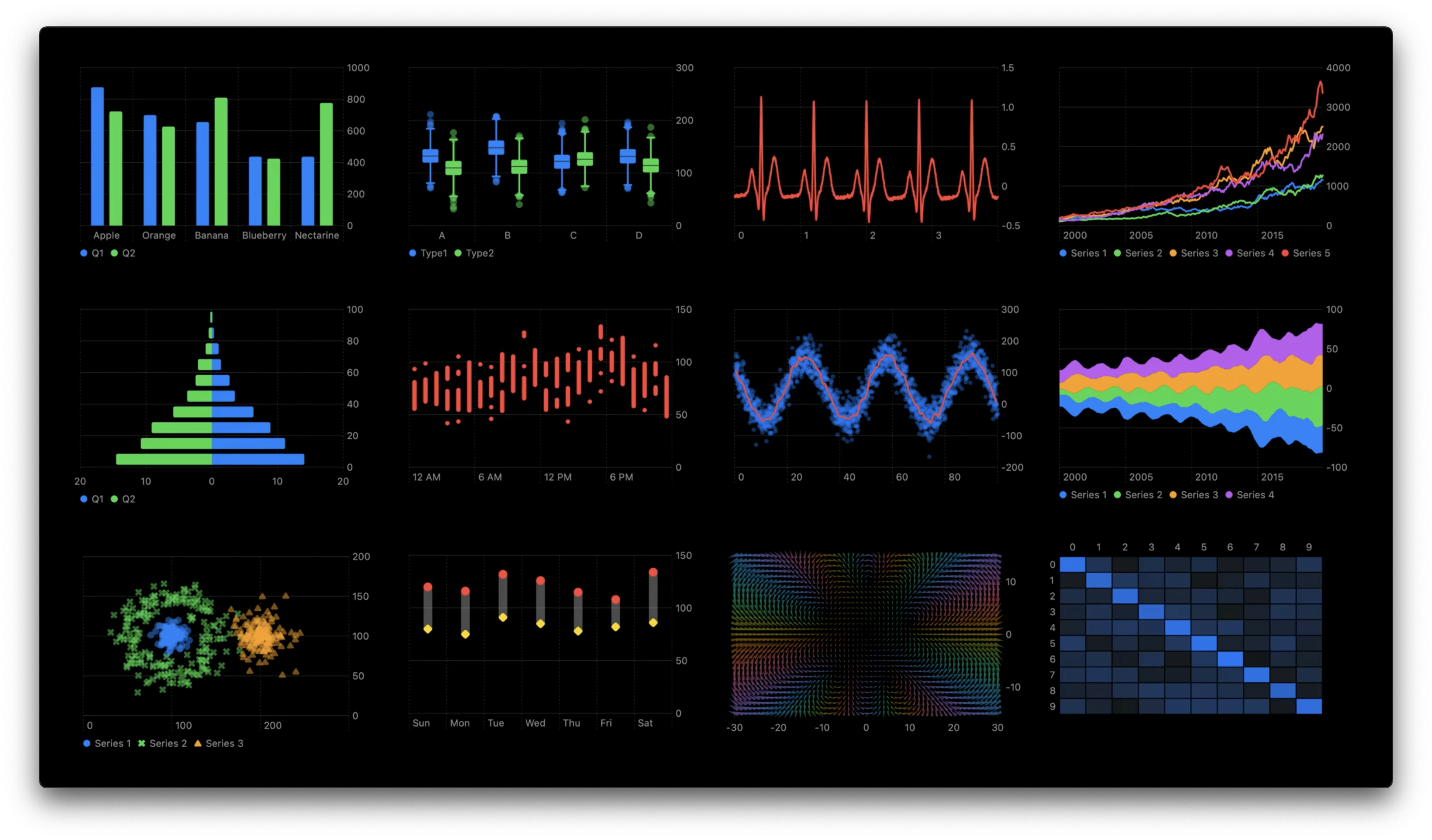
In addition to these, there are many more styles that can be implemented, so Charts really needs to be studied carefully.
But this article mainly introduces three types: bar chart (BarMark), point chart (PointMark) and line chart (LineMark). The following will first introduce the basic use of charts, and then introduce the use of each style in turn and in detail (the use of each style is roughly the same, but each has its own characteristics. For example, a line chart can display multiple lines at a time, and a bar chart can display multiple lines at a time. Charts can be customized to display multiple colors in one chart).
Basic usage
Before you start making a chart, you first need to prepare your data. Suppose we want to count the shape of an object.
Data are as follows:
| Style | Quantity |
|---|---|
| cube | 5 |
| Sphere | 4 |
| cone | 4 |
The data structure here is one-to-one, with one type corresponding to one quantity, so it can be said to be “one-dimensional”.
Define data structure and data
The following data structures and data are applicable to three styles of charts and are basic models.
The structure defined for the data structure is as follows:
struct ToyShape: Identifiable {
     var type: String
     var count: Double
     var id = UUID()
}
The initialized array to store data is as follows:
var data: [ToyShape] = [
     .init(type: "cube", count: 5),
     .init(type: "Sphere", count: 4),
     .init(type: "cone", count: 4)
]
How to create a simple chart
**The usage methods of the three styles of basic charts are almost the same, so only one will be discussed here. **
First you need to import the Charts package, as follows:
importCharts
Then the method of use is very simple. First create a Chart interface as a container for displaying data:
Chart {
	//adding data
}
The next step is to turn the data into points/lines/bars, corresponding to PointMark()/LineMark()/BarMark().
The following uses a bar chart for demonstration. If you want to change the style, you only need to change it to the corresponding name. In order to write less code or facilitate changes, it is recommended to use ForEach (it will be introduced later that if you do not use ForEach, use ` directly Chart can also achieve the same effect), in addition to making the code concise, you can also sort by some means (using the id attribute of ForEach`):
Chart {
     ForEach(data) { shape in
         BarMark(
         //The x here represents the x-axis of the chart, and the y here represents the y-axis of the chart
         //It should be noted that the data type here is PlottableValue
             x: .value("shape", shape.type),
             y: .value("total", shape.count)
         )
     }
}
At this time, the display effect is as follows:
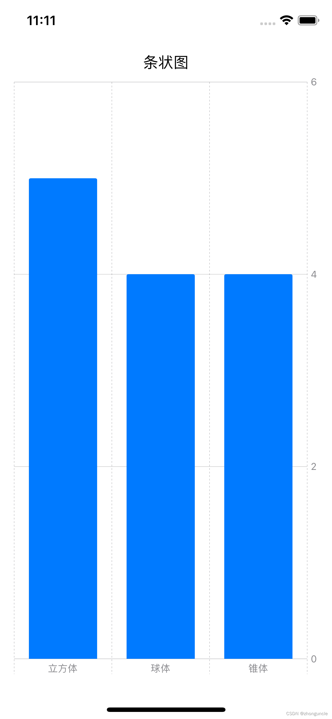
You can see the effect is good. And in this case, if you want to change to other styles, you only need to change the BarMark in the code, without having to change it one by one.
Or you can add parentheses directly after Chart to achieve the same effect, as follows:
Chart(data) { shape in
     BarMark(
         //The x here represents the x-axis of the chart, and the y here represents the y-axis of the chart
         x: .value("shape", shape.type),
         y: .value("total", shape.count)
     )
}
Change it to a line graph as follows:
Chart {
     ForEach(data) { shape in
         LineMark(
             x: .value("shape", shape.type),
             y: .value("total", shape.count)
         )
     }
}
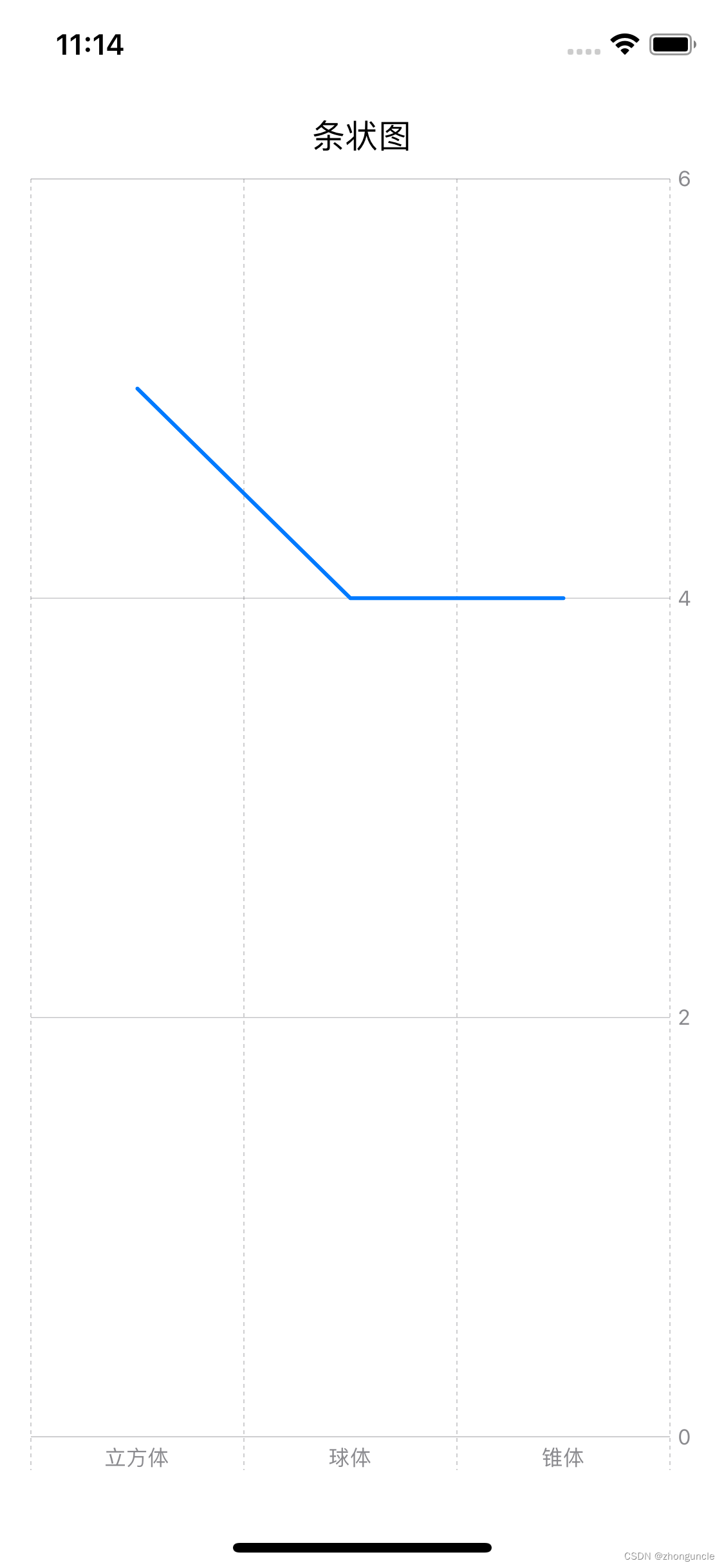
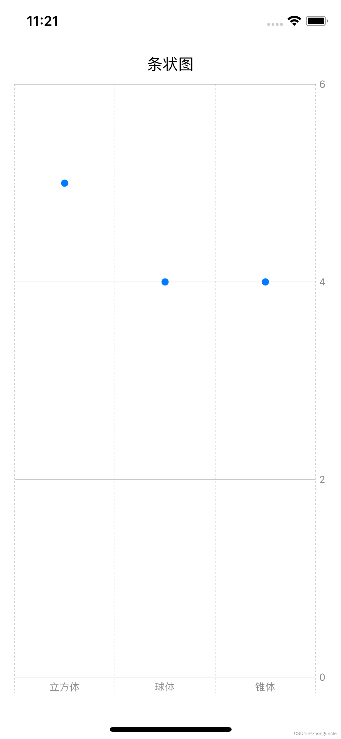
Click image:
Chart {
     ForEach(data) { shape in
         PointMark(
             x: .value("shape", shape.type),
             y: .value("total", shape.count)
         )
     }
}
Define the “two-dimensional” data structure and initialize the array to store the data
The previous section only made statistics based on the shape of the object, but what if we add color?
Assume the data is as follows:
| Quantity | Pink | Yellow | Purple | Green | Total |
|---|---|---|---|---|---|
| cube | 1 | 1 | 1 | 2 | 5 |
| Sphere | 2 | 1 | 1 | 0 | 4 |
| Cone | 0 | 2 | 1 | 1 | 4 |
| Total | 3 | 4 | 3 | 3 | 13 |
Such multiple data structures can be said to be one-to-two. Color and shape correspond to a quantity, which can be called “two-dimensional” data, which is more difficult than the previous “one-dimensional” data.
Then you need to change the data structure and the array to store the data, as follows:
//The data structure needs one more color
struct ToyShape: Identifiable {
     var color: String
     var type: String
     var count: Double
     var id = UUID()
}

//Initialize the array to store data
var stackedBarData: [ToyShape] = [
     .init(color: "green", type: "cube", count: 2),
     .init(color: "green", type: "sphere", count: 0),
     .init(color: "green", type: "cone", count: 1),
     .init(color: "Purple", type: "Cube", count: 1),
     .init(color: "Purple", type: "Sphere", count: 1),
     .init(color: "purple", type: "cone", count: 1),
     .init(color: "pink", type: "cube", count: 1),
     .init(color: "pink", type: "sphere", count: 2),
     .init(color: "pink", type: "cone", count: 0),
     .init(color: "yellow", type: "cube", count: 1),
     .init(color: "yellow", type: "sphere", count: 1),
     .init(color: "yellow", type: "cone", count: 2)
]
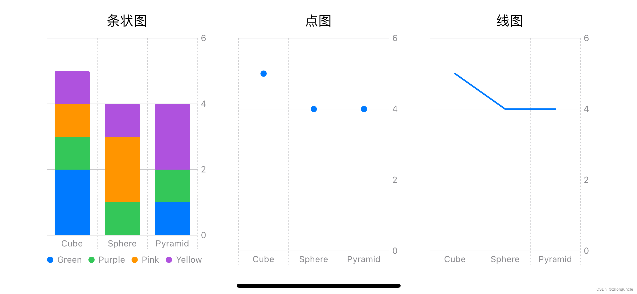
Let’s continue to take the bar chart as an example. This is not to save trouble, but to facilitate understanding. The three styles will be explained in turn later.
How to create a chart that can display “two-dimensional” data
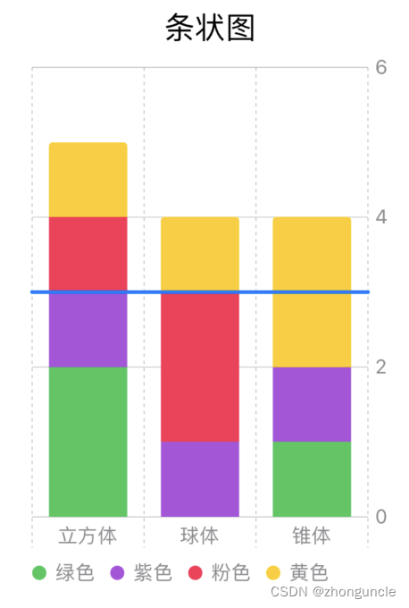
For this kind of “two-dimensional” data, you need to add a foregroundStyle(by:) method after BarMark() to display it, and a legend will also be displayed at the bottom left of the chart.
So let’s write a chart to show the proportions of different colors in different shapes. code show as below:
Chart {
ForEach(stackedBarData) { shape in
BarMark(
//Written like this, it shows the proportion of different colors in different shapes.
x: .value("shape", shape.type),
y: .value("total", shape.count)
)
//Since the colors here may not correspond to the ones that come with the system, we will introduce how to customize the colors for correct display later.
.foregroundStyle(by: .value("color", shape.color))
}
}
The display effect is as follows:
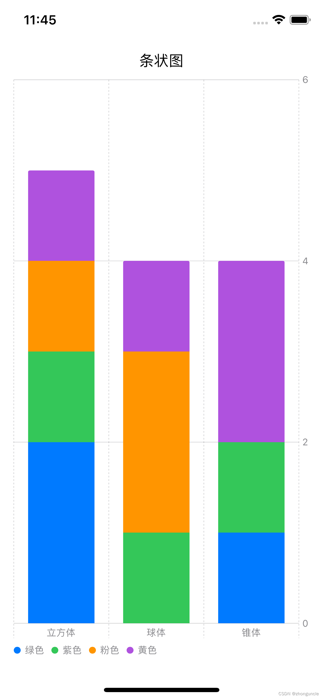
Here you can intuitively see the proportions of different colors in different shapes. But if you look carefully you will find that the colors here are not corresponding
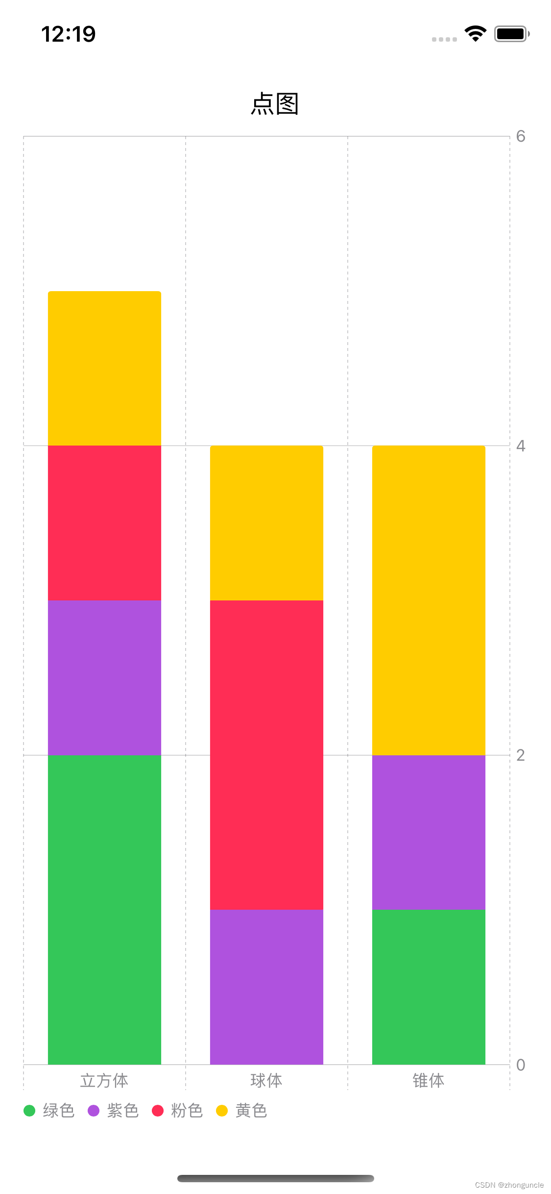
So how are line graphs and point graphs displayed?
The line graph will look very complicated, as follows:
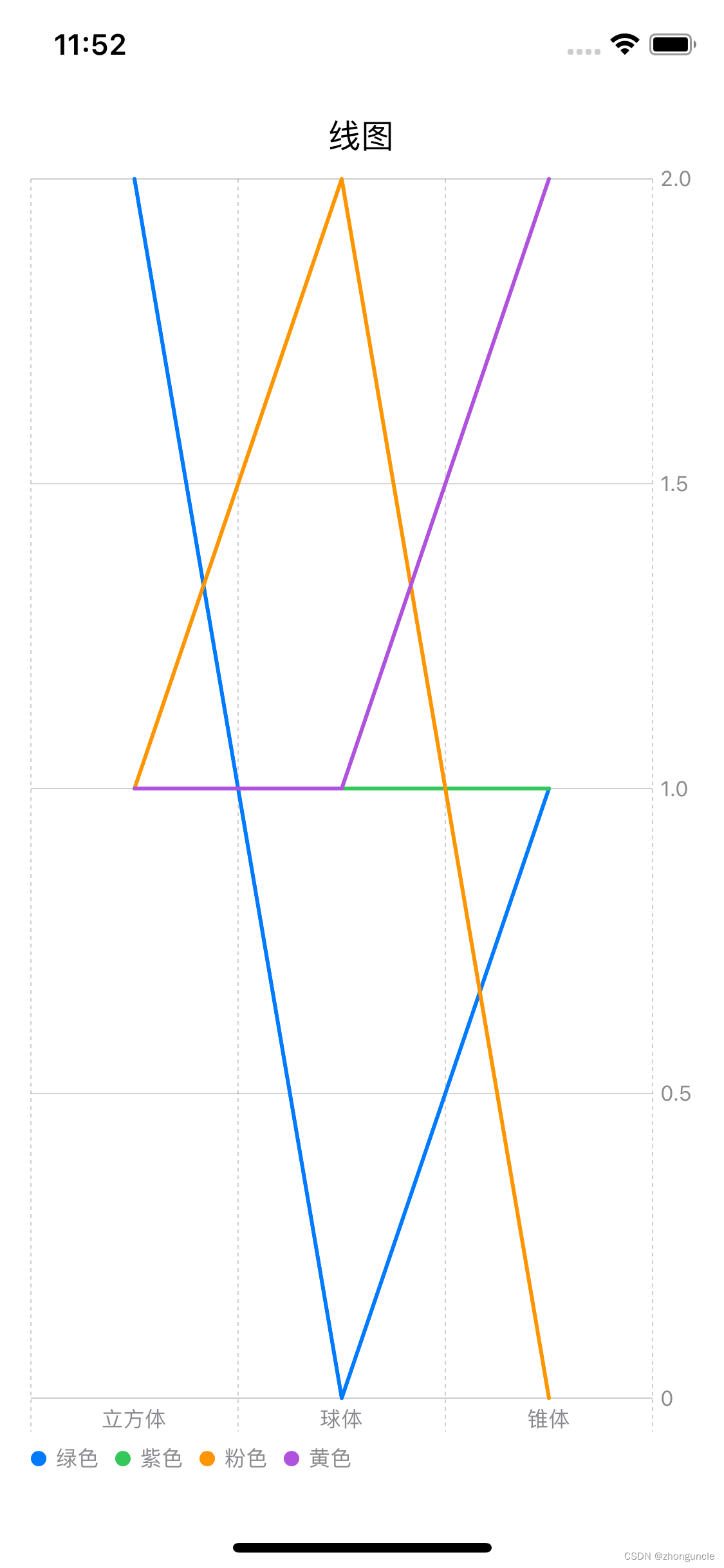
Each line represents a color, and each X-axis area corresponds to a shape.
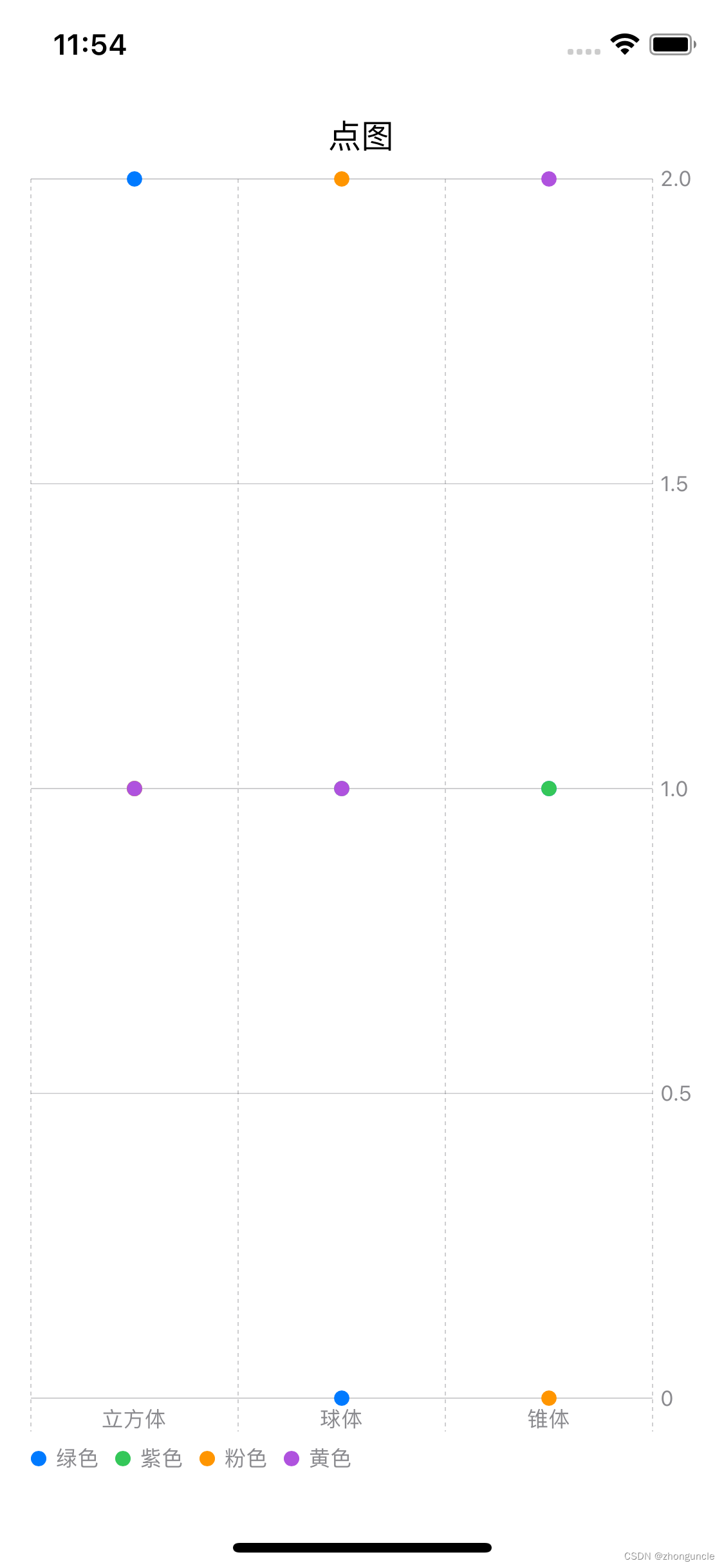
Point plots are read in the same way as line plots. Different colored points represent different colors. Each X-axis area corresponds to a shape, but it looks much simpler, as follows:
Customize the color of the chart
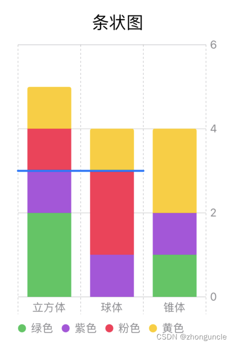
In the chart in the previous section, since the colors may not correspond to the ones that come with the system, developers need to manually customize them to display the correct colors.
Developers need to use the chartForegroundStyleScale() keyword after Chart to associate the green, purple, pink and yellow strings with colors (system built-in or custom colors). as follows:
Chart {
ForEach(stackedBarData) { shape in
BarMark(
x: .value("shape", shape.type),
y: .value("total", shape.count)
)
.foregroundStyle(by: .value("color", shape.color))
}
}
//Here, the string is mapped to the system's own colors so that the correct colors can be displayed.
.chartForegroundStyleScale(["green": .green, "purple": .purple, "pink": .pink, "yellow": .yellow])
Now the display effect is as follows:
You can see that the colors are displayed correctly.
Advanced usage
Let’s talk about some usage methods that have not been mentioned just now.
Add contrast line (Rule Mark)
I don’t know the Chinese name of this thing, but it is generally used for comparison and sometimes for drawing, so it is called a contrast line.
Sometimes you can see a horizontal line in the chart to indicate exceeding a certain data. For example, the blue horizontal line in the picture below can be used to compare data:
The method is very simple, just add a RuleMark in the field of Chart (that is, within the curly brackets), as follows:
RuleMark(y: .value("Contrast line", 3))
.foregroundStyle(.blue)
The ordinate y is used here, so can the abscissa x be used? The answer is yes, but it is generally not used for bar charts, but more for line charts and point charts. Because there is no need to use bar graphs, but in point graphs and line graphs, they can be used to locate points or divide areas.
Of course, this RuleMark can also control its starting point and end point. Here we continue to take the above picture as an example:
RuleMark(xStart: .value("Start", "Cube"), xEnd: .value("End", "Sphere"), y: .value("Value", 3))
.foregroundStyle(.blue)
After adding the starting point and end point, the effect is as follows:
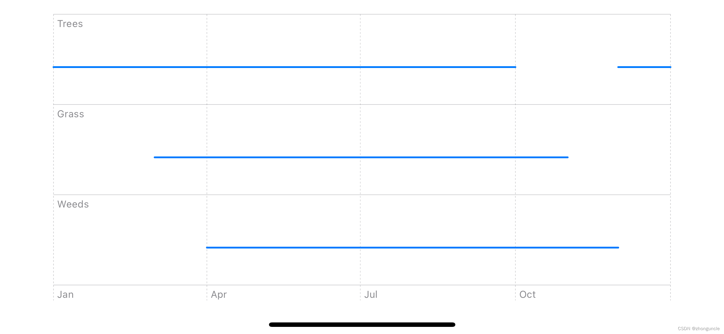
Of course, RuleMark can also be used directly for graphing. The following is a graph that counts what to plant each month:
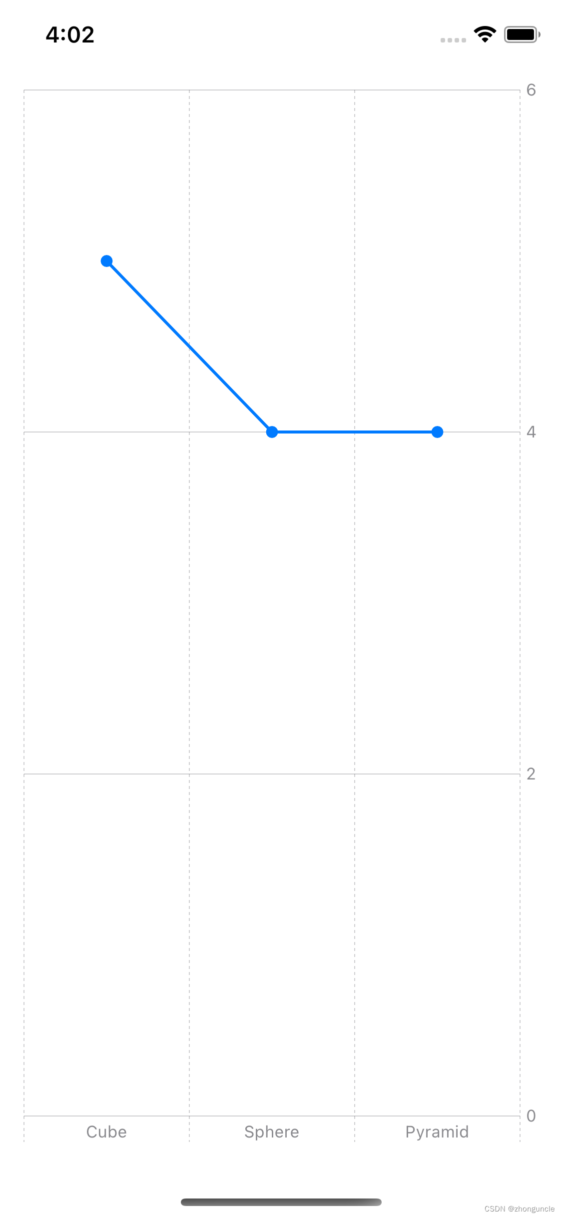
Add dots to the line graph
The line graphs just demonstrated are all polylines, but what if we want to add points to make the data easier to understand? As mentioned at the beginning, various styles can be superimposed, so you can directly add point images to achieve it.
import SwiftUI
importCharts

struct ToyShape: Identifiable {
     var type: String
     var count: Double
     var id = UUID()
}

var data: [ToyShape] = [
     .init(type: "Cube", count: 5),
     .init(type: "Sphere", count: 4),
     .init(type: "Pyramid", count: 4)
]

struct ContentView: View {
     var body: some View {
         VStack {
             Chart(data) { data in
                 LineMark(
                     x: .value("Shape Type", data.type),
                     y: .value("Total Count", data.count)
                 )

                 //Add point pictures to combine to form
                 PointMark(
                     x: .value("Shape Type", data.type),
                     y: .value("Total Count", data.count)
                 )
             }
         }
         .padding()
     }
}
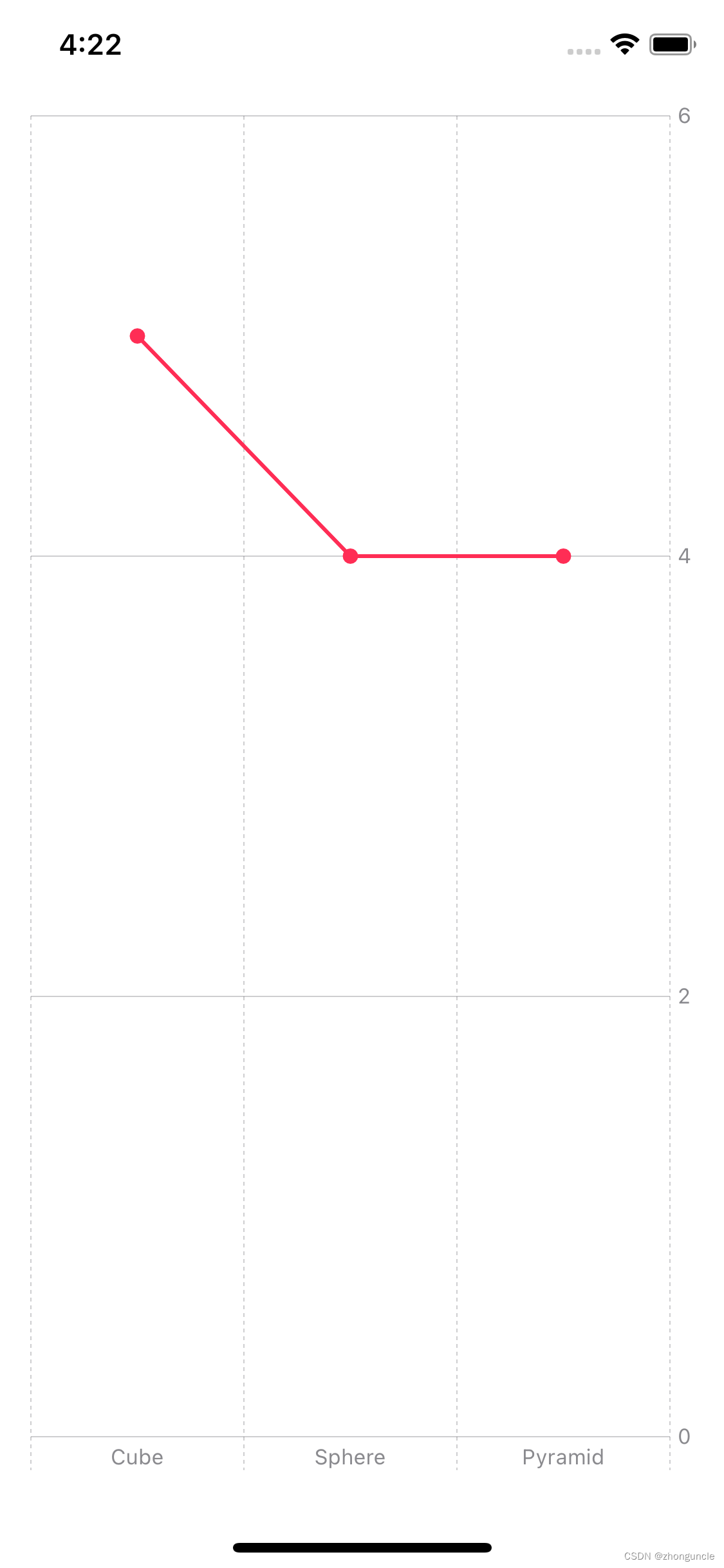
Custom chart color
This is the same as other components. You can directly use the foregroundStyle attribute of Chart, as follows:
import SwiftUI
importCharts

struct ToyShape: Identifiable {
     var type: String
     var count: Double
     var id = UUID()
}

var data: [ToyShape] = [
     .init(type: "Cube", count: 5),
     .init(type: "Sphere", count: 4),
     .init(type: "Pyramid", count: 4)
]

struct ContentView: View {
     var body: some View {
         VStack {
             Chart(data) { data in
                 LineMark(
                     x: .value("Shape Type", data.type),
                     y: .value("Total Count", data.count)
                 )

                 PointMark(
                     x: .value("Shape Type", data.type),
                     y: .value("Total Count", data.count)
                 )
             }
             //You can change the color here
             .foregroundStyle(Color.pink)
         }
         .padding()
     }
}
If you want to modify the color of the point plot or line plot, use the foregroundStyle attribute after the corresponding LineMark or PointMark.
remind
Since there are a lot of things to dig out of the charts, I will certainly never finish writing one blog. I will continue to write related blogs in the future. If I do, I will post a link here.
If you still have some unresolved questions after reading this article, then please check the official documentation “Swift Charts”, because currently on macOS, Charts is still Beta version, so some of the contents of this article may be modified later. If you find something that cannot be used, please leave a comment and let me know.
I hope these will help someone in need~