How to use R language to draw charts and graphs (line, curves, etc.)
Preface
If you are studying or engaged in data analysis-related, you must have used or been told to use R language. But with so many languages for data analysis, why use R? Because R can output very nice charts for publication. It may not be necessary for blogs, but it is necessary for publications such as papers and books. After all, the charts in most publications are not in color or flashy.
Notice, this article just record how to use R to draw charts or graphs, so it provides a brief introduction to statements. If you want to see a comprehensive introduction to statements, you can read the official document: [“An Introduction to R”] (https://cran.r-project.org/doc/manuals/r-release/R-intro.pdf)
Draw various charts
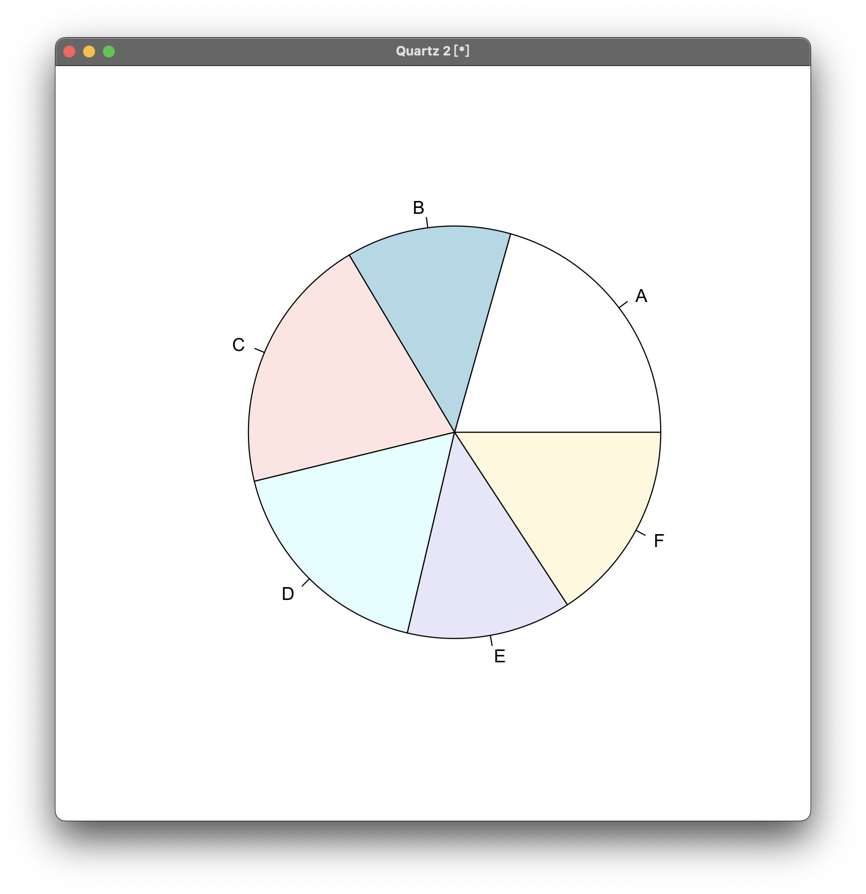
Draw a fan chart
Let’s create a new chart, but without coordinate axis.
First, we need some data to display. This part is as follows:
margin.table(UCBAdmissions,3) -> Department
margin.table(UCBAdmissions, 3) will generate a table Department through the data set UCBAdmissions (it is Berkeley admissions data and embedded in R). Then use the pie() function to generate a pie chart with proportions of each part of “Department”:
pie(Department)
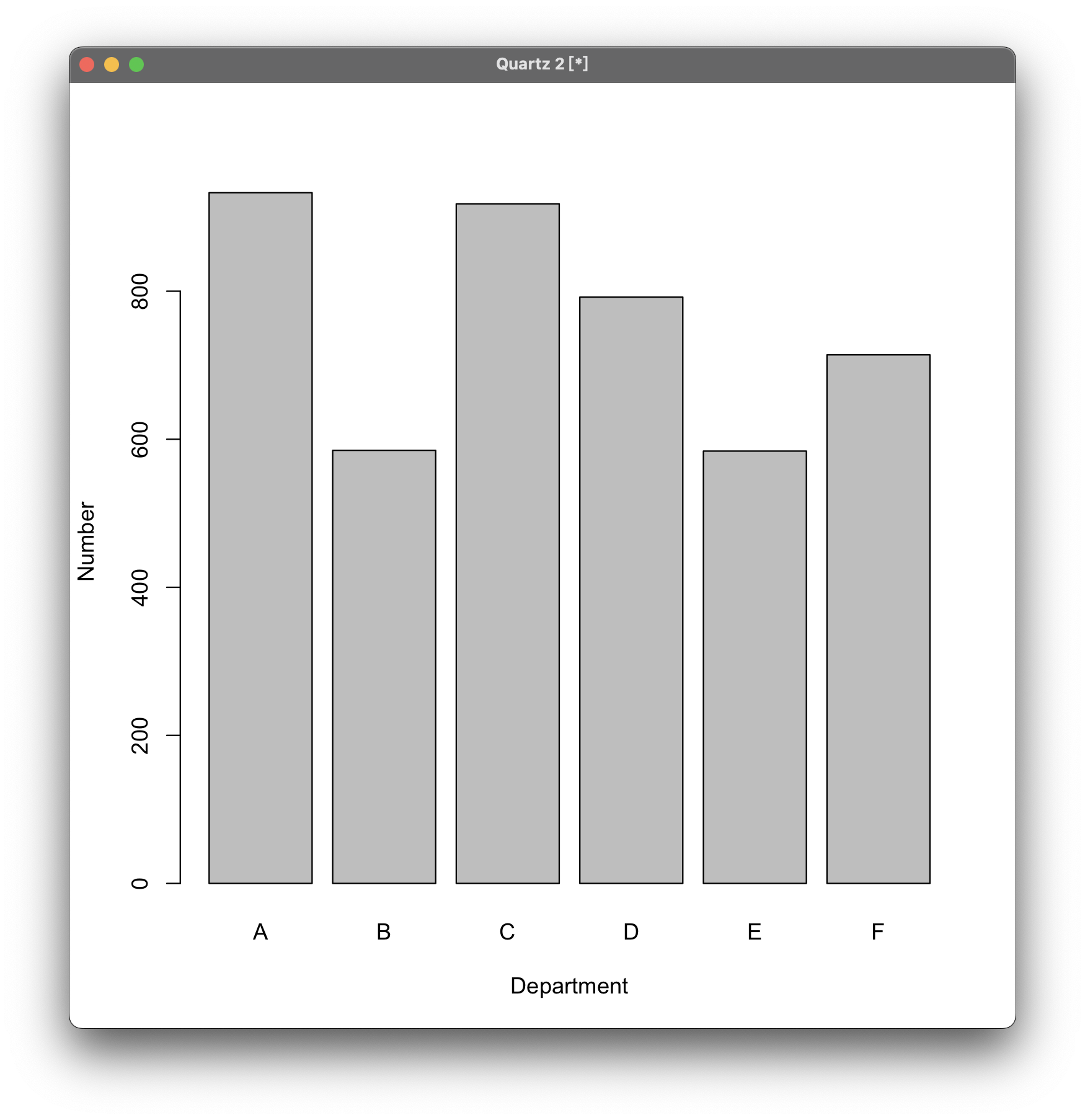
Draw a bar chart
Simple bar chart
Still using the previous data table to generate bar charts. To generate a bar chart, use the barplot() function. xlab= is the title of the horizontal axis, and ylab= is the title of the vertical axis:
barplot(Department, xlab="Department", ylab="Number")
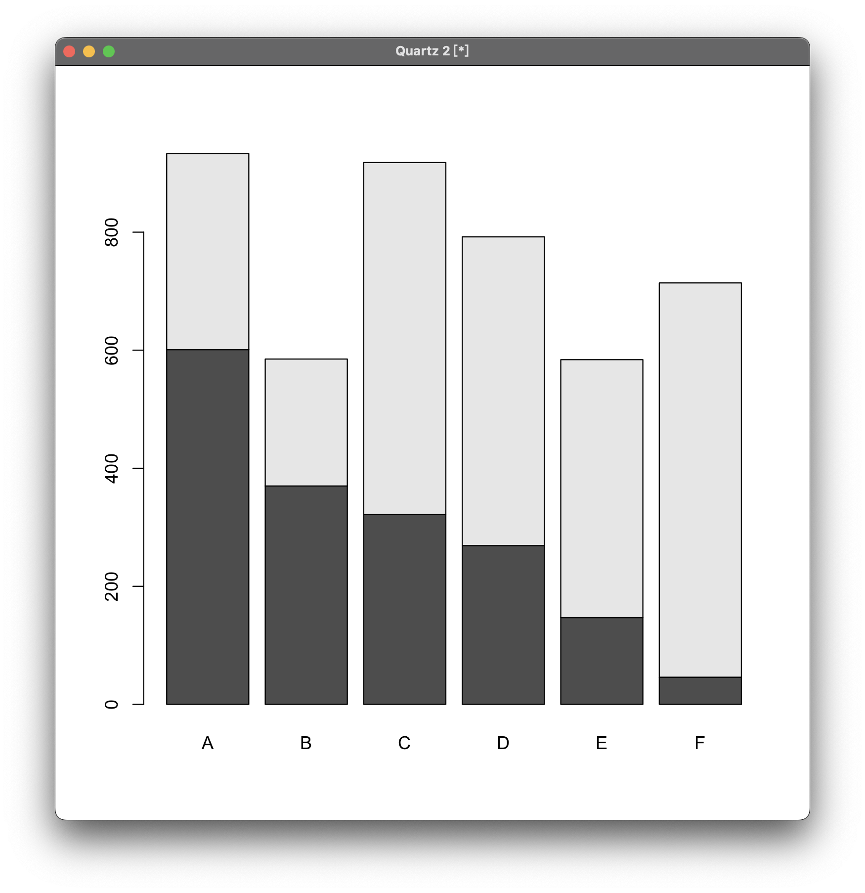
Composite Bar Chart
When generating a composite bar chart, the above data table format is not enough, so regenerate a table:
margin.table(UCBAdmissions, c(1,3)) -> Admit.by.Dept
If directly use barplot() to call data, the generated bar chart is as follows:
barplot(Admit.by.Dept)
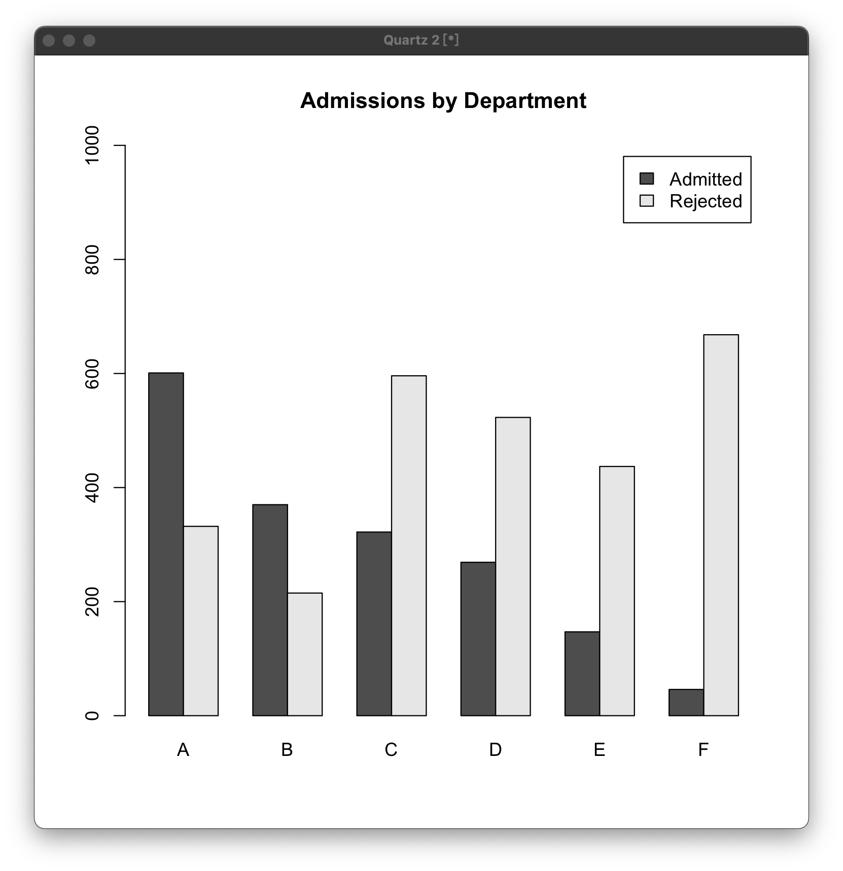
Side by Side Bar Chart
If generate two bar charts side by side, use the following statement:
barplot(Admit.by.Dept, beside=T, ylim=c(0,1000), legend=T, main="Admissions by Department")
beside=T means beside is true (T means True). If it is true, a side-by-side bar chart will be drawn. If it is F false, then Composite bar chart above will be generated; ylim = represents the range of the vertical axis; legend represents the legend, which is in the upper right corner of the figure below. You can use T or F to indicate whether to display the legend, or you can directly enter the value to customize the legend; main represents the main title .
Draw a curve chart
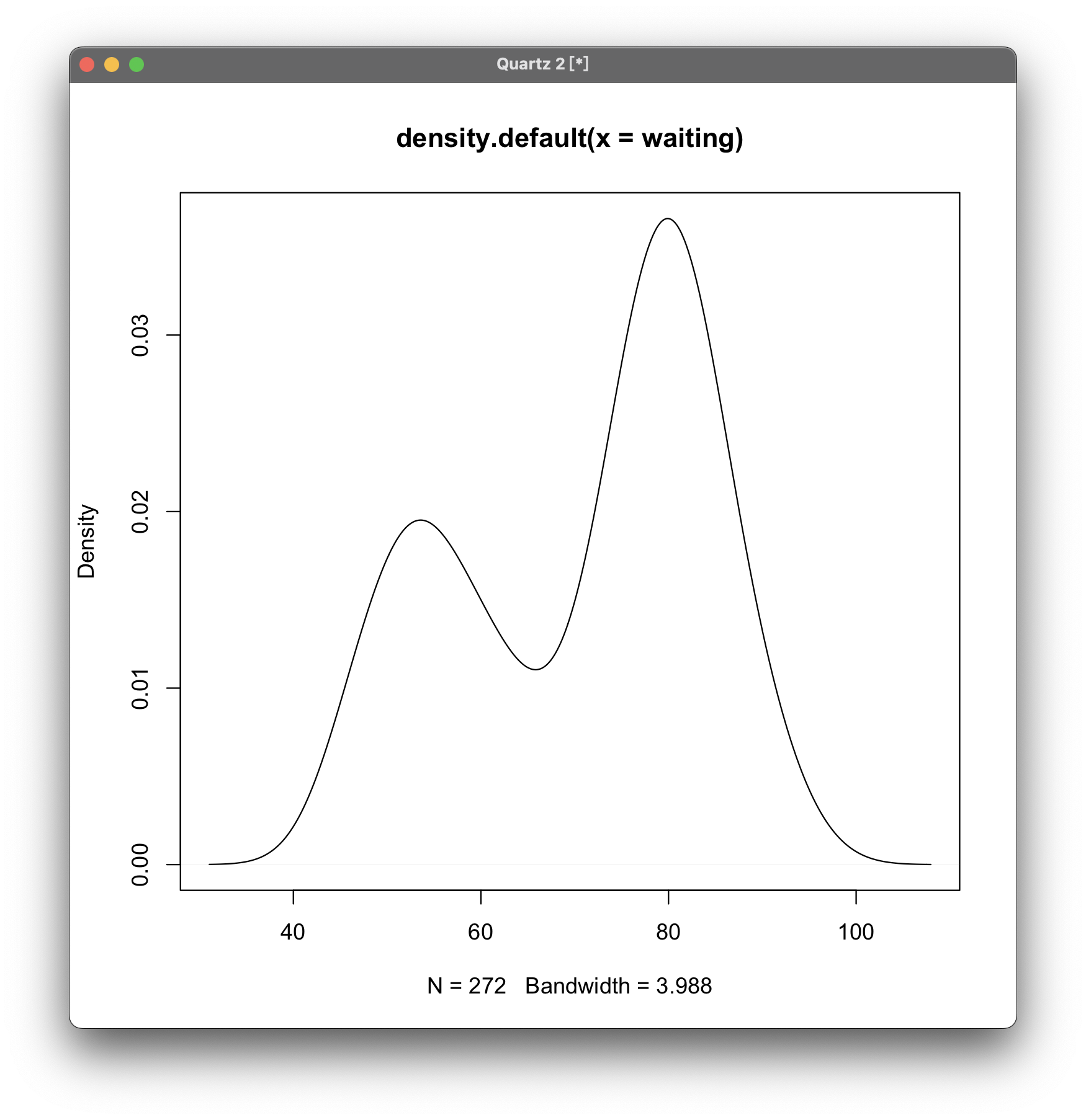
The category of above table classified cannot be used to draw a curve chart, so let’s use the faithful data set for demonstration.
First introduce the faithful data set to prepare:
attach(faithful)
Then use plot(density(...)) to generate the chart:
plot(density(waiting))
waiting is the x-axis label.
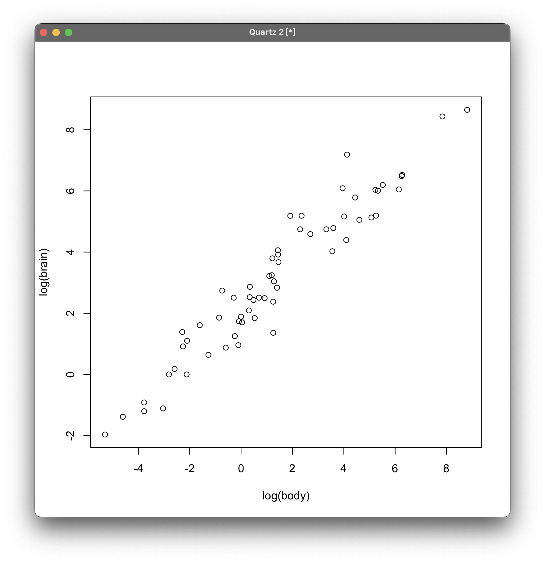
Draw a dot plot chart
Dot plots need to use a new data set for demonstration. You need enter below lines manually which starting with >:
> data(mammals, package="MASS")
> str(mammals)
'data.frame':	62 obs. of  2 variables:
 $ body : num  3.38 0.48 1.35 465 36.33 ...
 $ brain: num  44.5 15.5 8.1 423 119.5 ...
The first line generates a dataset mammals. Enter str(mammals) to see the content. But the display is not fully because it is too long.
Then use the attach() function to import the dataset, then use the plot() function to draw the plot chart:
attach(mammals)
plot(log(body), log(brain))
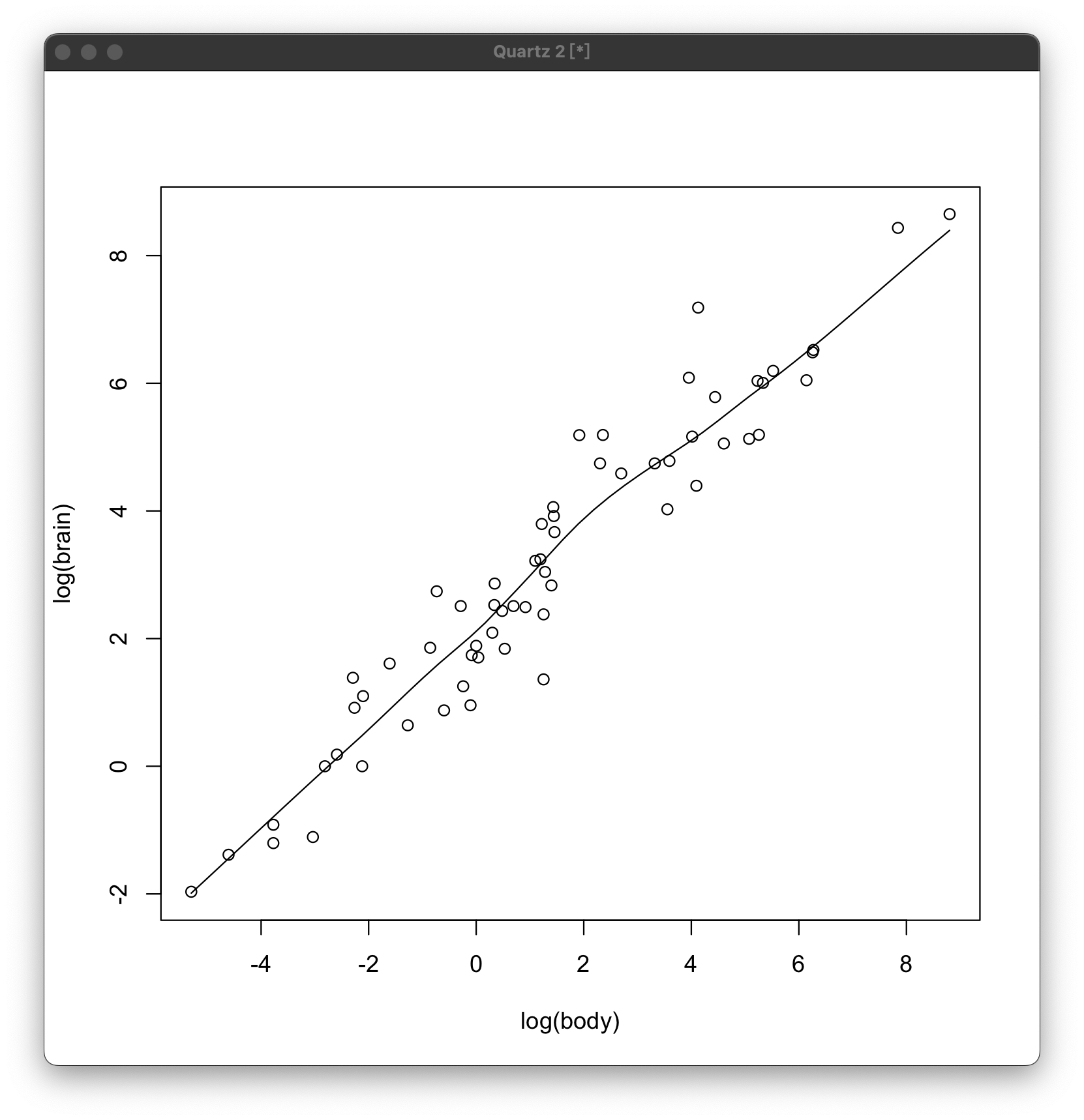
Or you can use:
plot(x=body, y=brain, log="xy")
At this time, you may find that the points seem to be gathered near a line, and R supports drawing this line:
scatter.smooth(log(body), log(brain))
Draw graphs (coordinate axes, curves and etc.)
Add coordinate axis
The mostly first step in drawing is adding axes. The statement is very simple, just need the plot() function, as follows:
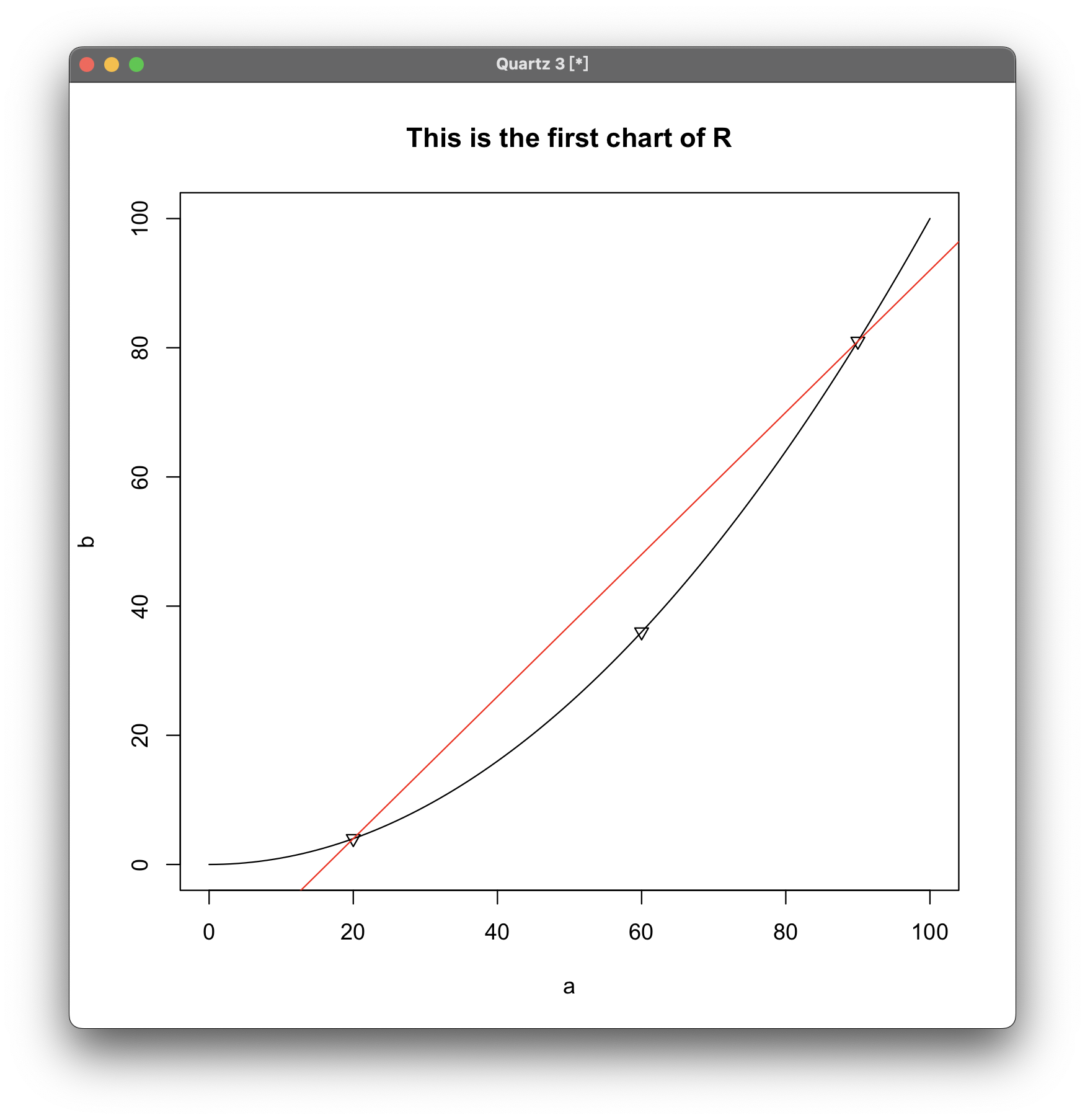
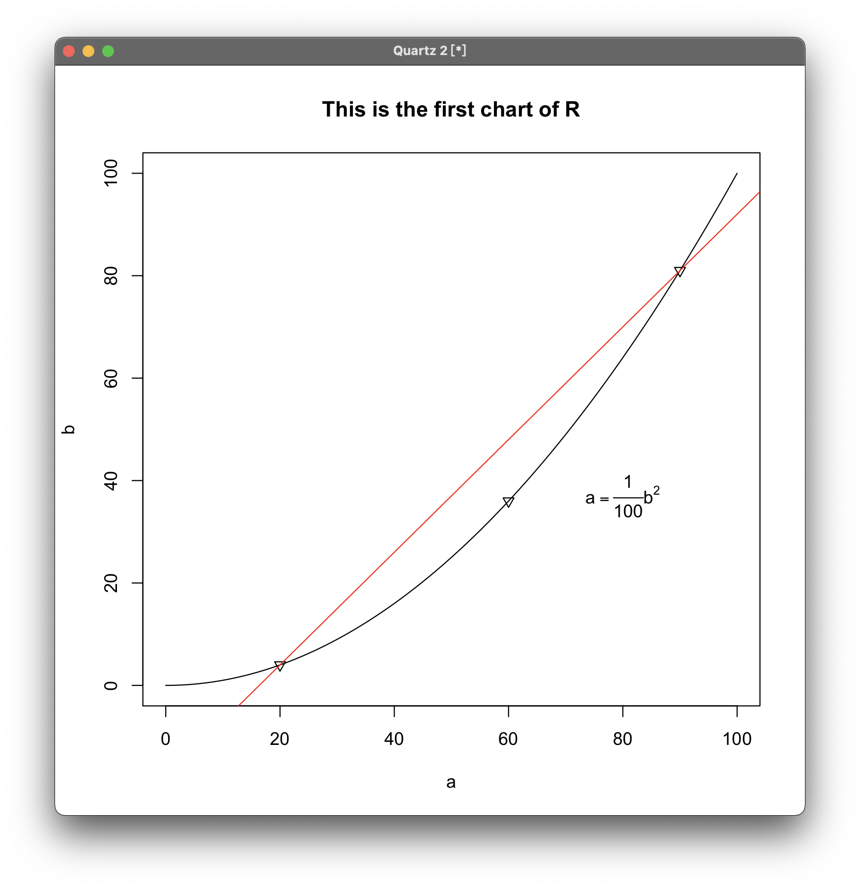
plot(0:100, 0:100, type="n", xlab="a", ylab="b")
The effect is:
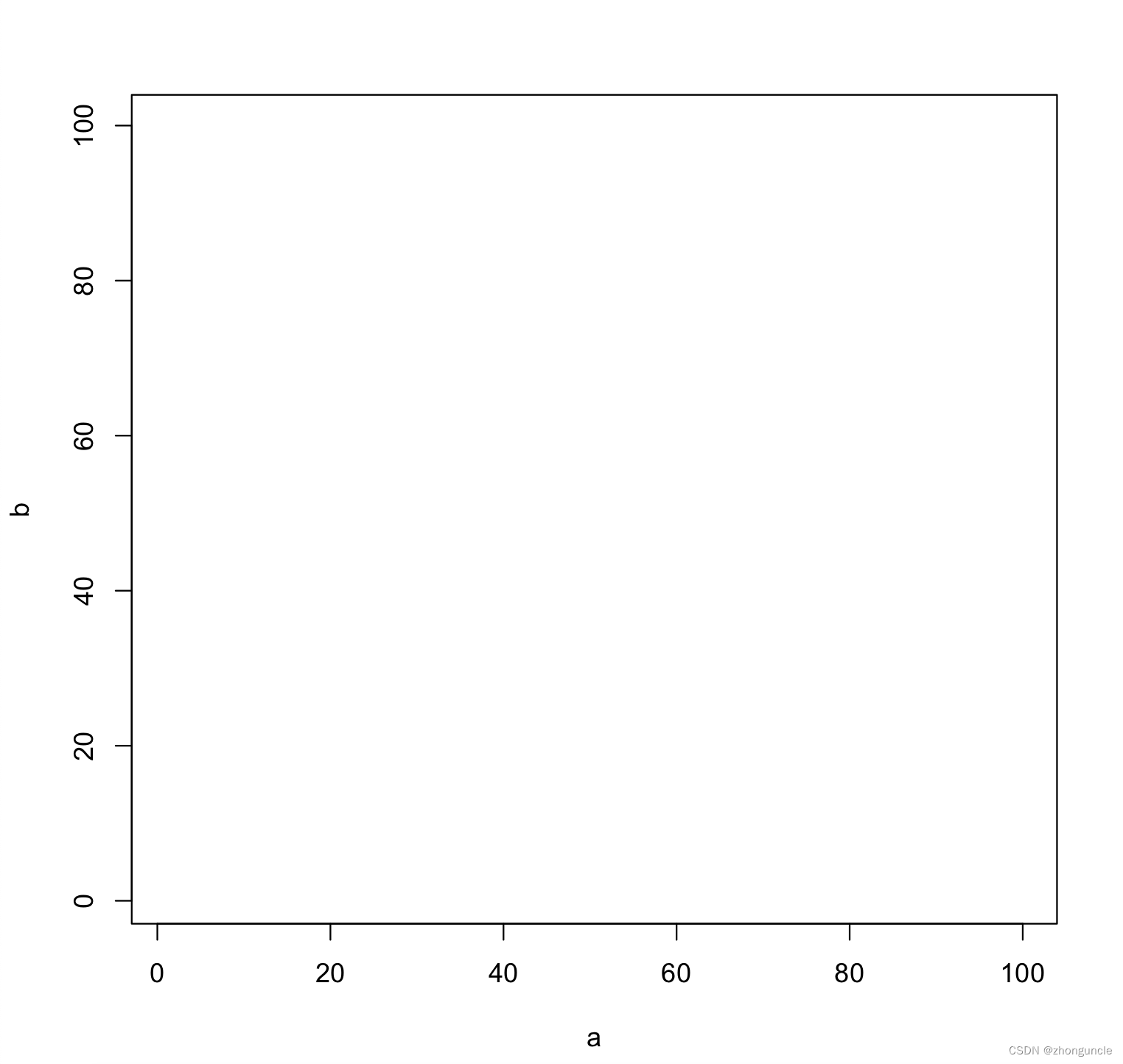
The plot() function is a “high-level” function. 0:100 in brackets means the coordinates start from 0 to 100; type="n" means that only the coordinate axis is drawn without any ohter things (if you are interested, you can remove this parameter and see the default plot chart); xlab="a" represents the label of the x-axis, and ylab="b" is the same.
Draw curve
Then to draw the curve of b=0.01a^2 in above coordinate axis, you need to use the curve() function:
curve(x^2/100, add=TRUE)
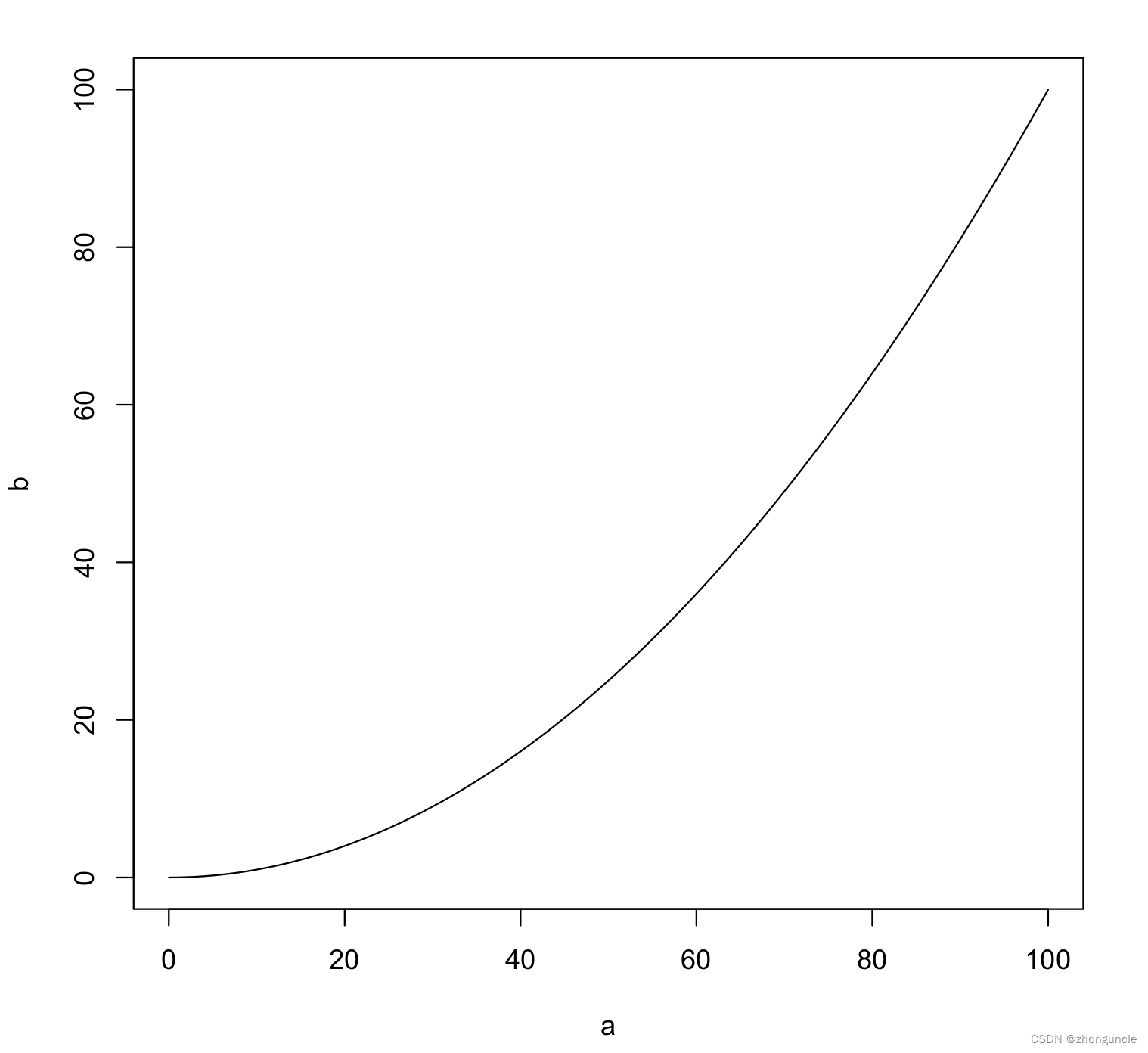
I should just explain what add=TRUE does here. add=TRUE will force the curve() function to draw the curve as a “low-level” image, thereby drawing it on top of the currently existing image (if there is one).
Draw points
There are two types of points: drawing individual points and drawing points on a curve. But no matter which type, you generally need to use the points() function.
In order, let’s talk about the former first. The statement to draw individual points is very simple, just use the coordinates directly, as follows:
points(100,50)
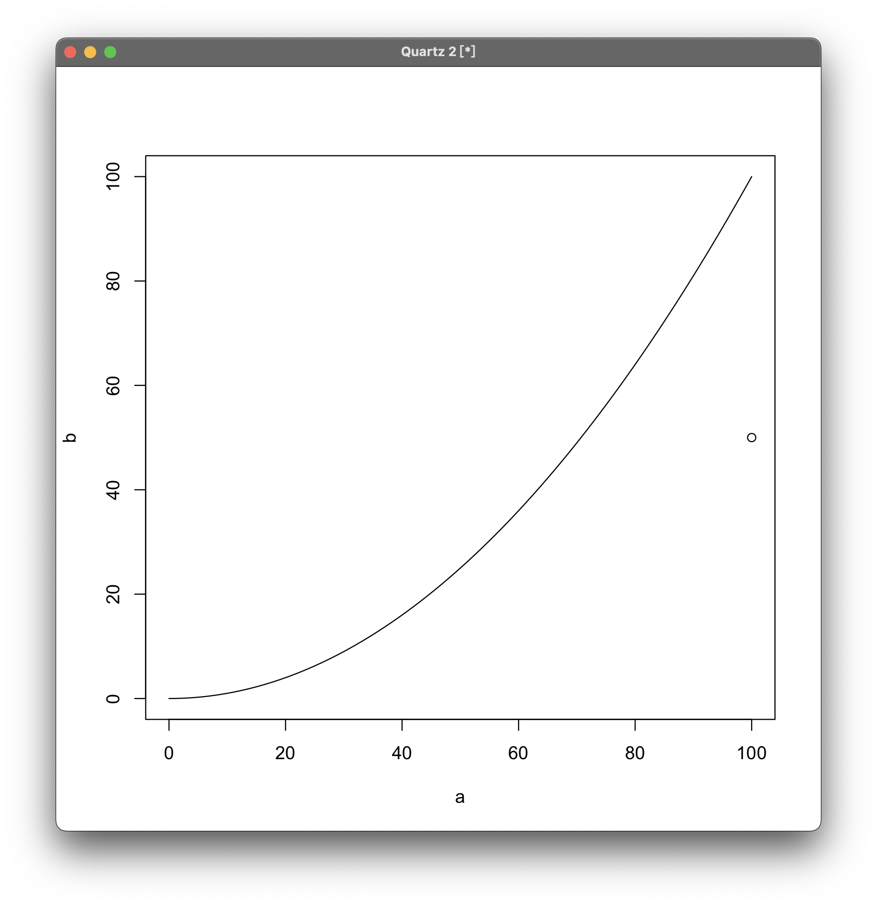
You can see that a hollow dot is drawn on the right side of the curve.
So if you want to mark some points on the curve of $b=0.01a^2$? There are two methods. One is inputting one by one, but it can be combined together to make it a little easier:
points(x=c(20, 60, 90), y=c(4, 36, 81), pch=6)
But you can also use another method, just enter values of x and function, as follows:
points(x<-c(20,60,90), y=x^2/100, pch=6)
Both have the same effect:
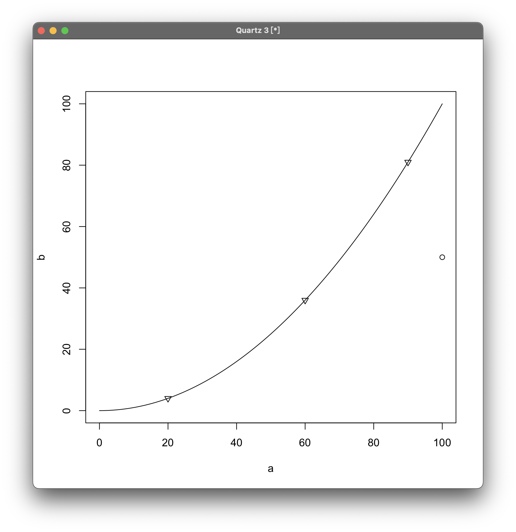
Change the style of points
Can we change the point style? Just add the pch parameter:
points(100,50, pch=...)
pch= can be directly followed by symbols, such as + and *, just wrap it in quotation marks. For example, if you want to change the dot into an asterisk *:
points(100,50, pch="*")
It can also be followed by numbers. The contents represented by different numbers are as follows:

In addition:
- Numbers between 26 and 31 have no effect;
- The range between 2/32 and 127 corresponds to the ASCII code;
- Between 128 and 255 are original characters that are only in single-byte positions and use symbolic fonts. Among them, 129 to 159 can only be used in Windows;
- -32 is used to use Unicode codes where supported.
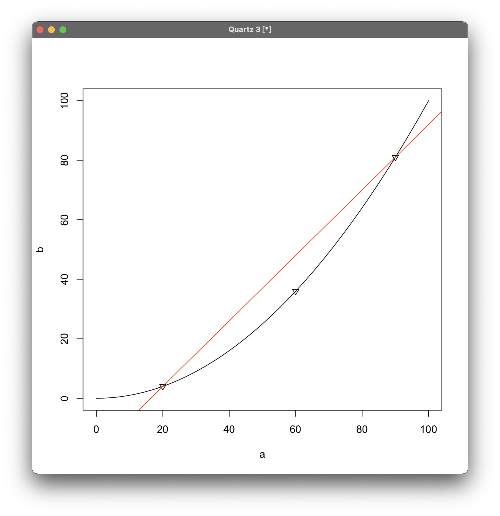
Draw a straight line (and customize the color of the line)
Suppose now need to draw a red straight line through two points on the curve, then you can use the abline() function and the col parameter to set color:
abline(a=-18, b=1.1, col="red")
a= is followed by the ordinate; b= is followed by the slope; col= is followed by the color.
Set main title
To set the main title, you need to use the title(main="...") function:
title(main="This is the first chart of R")
Draw text anywhere in chart image
Suppose we want to write a functional expression next to the curve b=0.01a^2, then we can use the text() function:
text(x=80, y=37, expression(a == frac(1,100) * b^2))
a and b will be displayed on the picture, but the previous x and y cannot be modified.
I hope these will help someone in need~