How to modify TabView in SwiftUI
Reading Suggestions and Tips
- All codes in this article apply to the latest versions of iOS 15 and SwiftUI.
- This article does not list all attributes because some attributes will conflict with other attributes and become invalid, so attributes that can be ignored are ignored.
How to create a simple TabView
In SwiftUI, we can easily implement the tab effect TabView, as follows:
struct ContentView: View {
     var body: some View {
         TabView {
             Text("First Tab")
                 .badge(10) /* This is new in iOS 15.0 and cannot be used in previous versions */
                 .tabItem {
                     Image(systemName: "1.square.fill")
                     Text("first page")
                 }
             Text("Another Tab")
                 .tabItem {
                     Image(systemName: "2.square.fill")
                     Text("Second page")
                 }
             Text("Last Tab")
                 .tabItem {
                     Image(systemName: "3.square.fill")
                     Text("Page 3")
                 }
         }
     }
}
The implemented interface is as follows:
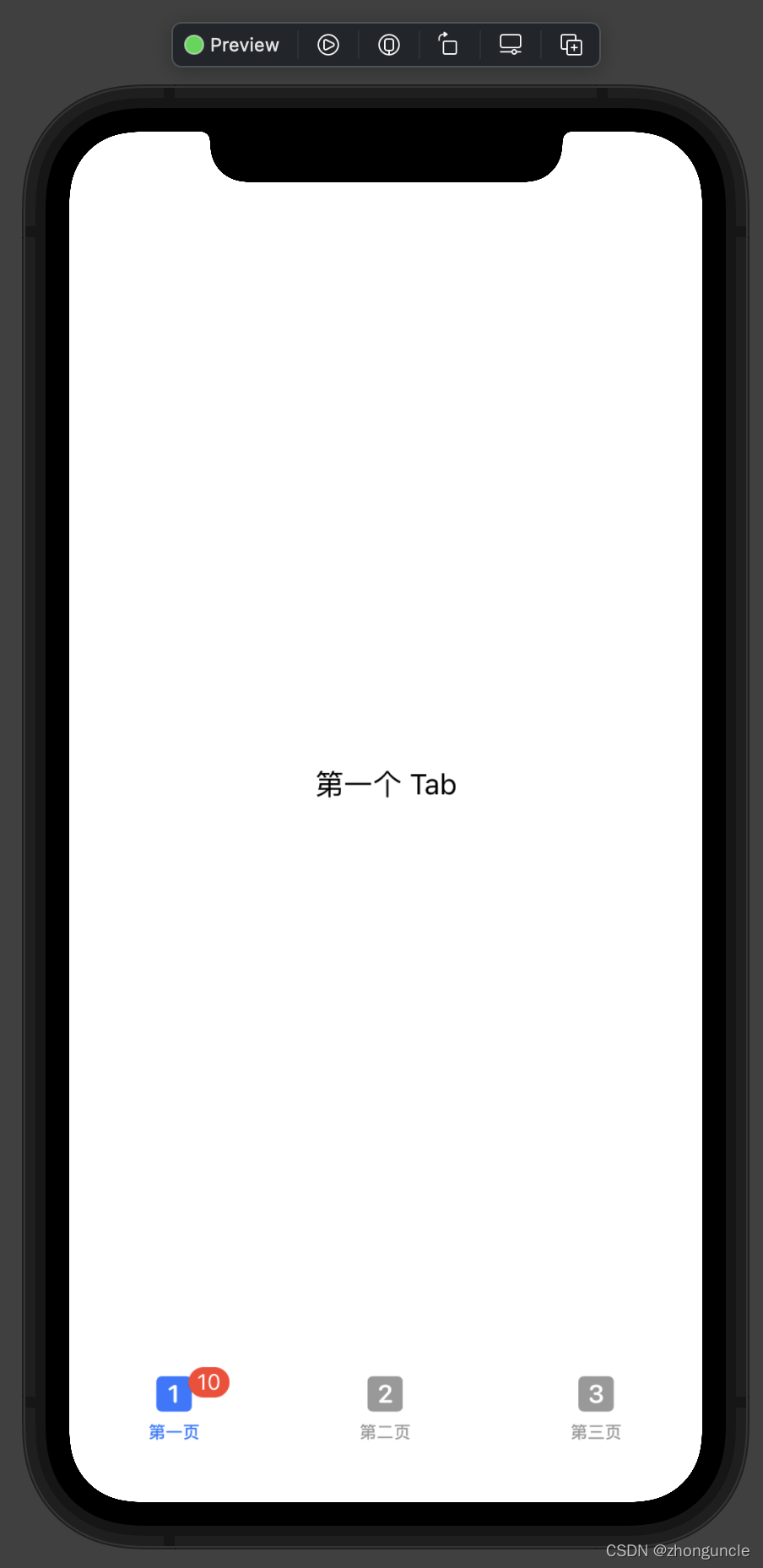
.tabItem { } can only contain one Image and Text, or vice versa.
But when we needed to modify some of his attributes, we found that we couldn’t modify them. For example, if we want to modify the color of a tabItem, we use .foregroundColor() and find that there is no change.
This may be because SwiftUI is not perfect enough, so we need to use UIKit at this time. There are two ways to modify it:
UITabBar.appearance()(can only be roughly modified)UITabBarItemAppearance()UITabBarAppearance()(can be modified in detail. This is recommended)
UITabBar.appearance() for rough modification
The first is to directly modify the properties of UITabBar.appearance(), but there is very little that can be modified. It is basically only used to modify the background color of the TabBar.
**For the sake of code simplicity, the complete usage code is attached at the end of this section. **
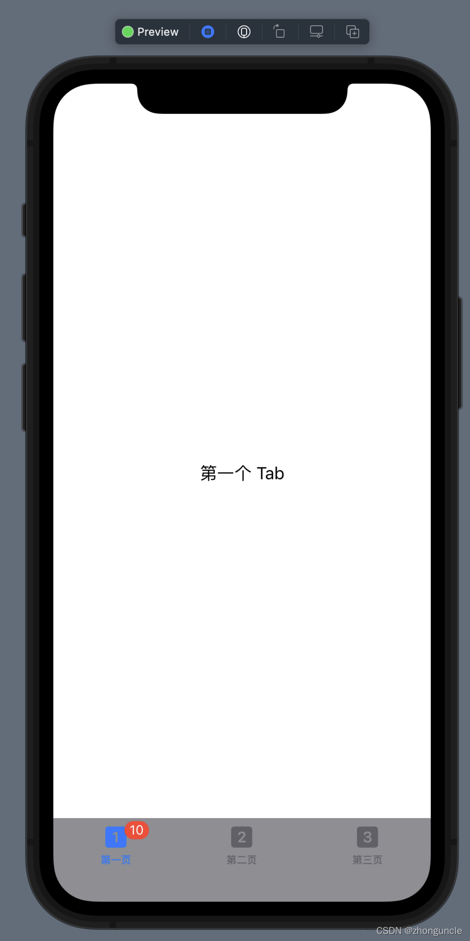
Modify the background color of the tab bar
//Modify the tab bar background color
UITabBar.appearance().backgroundColor = UIColor(Color.gray)
The modified style is as follows:
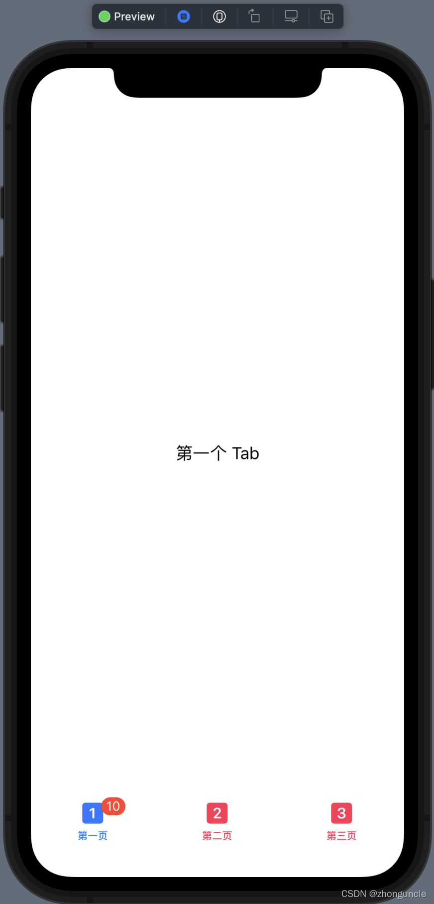
Modify the color of unselected items
//Modify the color of unselected items
UITabBar.appearance().unselectedItemTintColor = UIColor(Color.pink)
The modified style is as follows:
**We can find that there are other attributes, but the modification found no change. **
Can be used through init() or .onAppear(perform:).
So, the complete usage code is as follows:
struct ContentView: View {
     init() {
         //Modify the tab bar background color
         UITabBar.appearance().backgroundColor = UIColor(Color.gray)
         //Modify the color of unselected items
         UITabBar.appearance().unselectedItemTintColor = UIColor(Color.pink)
     }
     var body: some View {
         TabView {
             Text("First Tab")
                 .badge(10) /* This is new in iOS 15.0 and cannot be used in previous versions */
                 .tabItem {
                     Image(systemName: "1.square.fill")
                     Text("first page")
                 }
             Text("Another Tab")
                 .tabItem {
                     Image(systemName: "2.square.fill")
                     Text("Second page")
                 }
             Text("Last Tab")
                 .tabItem {
                     Image(systemName: "3.square.fill")
                     Text("Page 3")
                 }
         }
     }
}
Or use .onAppear(perform:):
struct ContentView: View {
     var body: some View {
         TabView {
             Text("First Tab")
                 .badge(10) /* This is new in iOS 15.0 and cannot be used in previous versions */
                 .tabItem {
                     Image(systemName: "1.square.fill")
                     Text("first page")
                 }
             Text("Another Tab")
                 .tabItem {
                     Image(systemName: "2.square.fill")
                     Text("Second page")
                 }
             Text("Last Tab")
                 .tabItem {
                     Image(systemName: "3.square.fill")
                     Text("Page 3")
                 }
         }
         .onAppear(perform: {
         //Modify the tab bar background color
             UITabBar.appearance().backgroundColor = UIColor(Color.gray)

             //Modify the color of unselected items
             UITabBar.appearance().unselectedItemTintColor = UIColor(Color.pink)
         })
     }
}
This method is too simple, so I recommend the following
UITabBarItemAppearance() and UITabBarAppearance() for detailed modifications
The use of this method is more complicated, so the length is longer. To keep the code neat and tidy, write it separately and list the complete code at the end.
The first is the objects (tabItem) in the TabBar, such as icon text. We need to declare a variable itemAppearance first, as follows
let itemAppearance = UITabBarItemAppearance()
Then first introduce the properties of tabItem:
Set the properties of tabItem
The color of the icon, which is the color of the Image
//The color of the icon of the unselected label
itemAppearance.normal.iconColor = UIColor(Color.green)
//The color of the icon of the selected label
itemAppearance.selected.iconColor = UIColor(Color.pink)
The attributes of the text, that is, the attributes of the Text part
For the sake of conciseness of the code, only modifying the text color is demonstrated here.
In addition to being able to modify the color, because it is an NSAttributedString type, you can also modify the font type, size, shadow, background, and even content. For more usage methods of NSAttributedString, you can view: https://www.hackingwithswift.com/articles/113/nsattributedstring-by-example
//The color of the title of unselected tags
itemAppearance.normal.titleTextAttributes = [.foregroundColor: UIColor(Color.green)]
//The color of the title of the selected tag
itemAppearance.selected.titleTextAttributes = [.foregroundColor: UIColor(Color.pink)]
Bubbles
**It should be noted that if the attributes in this part are only set to the value in the normal or selected state, then this value will be used no matter what the state is! **
background color
//Background color of bubbles for unselected tags
itemAppearance.normal.badgeBackgroundColor = UIColor(Color.black)
//The background color of the bubble of the selected label
itemAppearance.selected.badgeBackgroundColor = UIColor(Color.yellow)
Text attributes
For the sake of conciseness of the code, only modifying the text color is demonstrated here.
In addition to being able to modify the color, because it is an NSAttributedString type, you can also modify the font type, size, shadow, background, and even content. For more usage methods of NSAttributedString, you can view: https://www.hackingwithswift.com/articles/113/nsattributedstring-by-example
//The text color of the bubble of the selected label
itemAppearance.normal.badgeTextAttributes = [.foregroundColor: UIColor(Color.gray)]
//The text color of the bubble of the selected label
itemAppearance.selected.badgeTextAttributes = [.foregroundColor: UIColor(Color.black)]
Location
//The position of the bubble of the unselected label
itemAppearance.normal.badgePositionAdjustment = UIOffset(horizontal: -10, vertical: -10)
//The position of the bubble of the unselected label
itemAppearance.selected.badgePositionAdjustment = UIOffset(horizontal: 10, vertical: 10)
Position of title
**It should be noted that this offset is superimposed on the position offset of the bubble, but the horizontal axes of the two reference systems are opposite. **
//The position of the bubble title of the unselected label
itemAppearance.normal.badgeTitlePositionAdjustment = UIOffset(horizontal: -10, vertical: -10)
//The position of the bubble title of the unselected label
itemAppearance.selected.badgeTitlePositionAdjustment = UIOffset(horizontal: 10, vertical: 10)
After barItem is set, it is time to set the properties of TabBar, which is the UITabBarAppearance() part.
Set the overall properties of TabView
Similarly, we need to declare a variable appeareance first, as follows:
let appeareance = UITabBarAppearance()
Apply the previous settings of barItems
//Here we can apply the itemAppearance we set above to the stackedLayoutAppearance property of UITabBarAppearance()
appeareance.stackedLayoutAppearance = itemAppearance
Background image of TabBar
//TabBar background image
appearance.backgroundImage = UIImage(named: "test")
Background color of TabBar
//Background color of TabBar
appearance.backgroundColor = UIColor(Color.white)
The shadow of TabBar is the top “line”
//The shadow of TabBar is the top "line"
appearance.shadowColor = UIColor(Color.black)
tabItem placement format
//The placement format of tabItems. .automatic is the default format; .centered means to move to the middle as much as possible; .fill means to fill the TabBar as much as possible.
appearance.stackedItemPositioning = .centered
tabItem placement format
//The spacing between tabItems, but the biggest effect is that it is the same as the .fill format and will not exceed the view.
appearance.stackedItemSpacing = 2000
Finally, apply all settings to the view
//To apply all previous settings to the view
UITabBar.appearance().scrollEdgeAppearance = appeareance
However, there is one thing to note here. Some people will want to use the following code to apply settings:
//Do not use it. Because using this will not apply our settings for UITabBarAppearance()
UITabBar.appearance().standardAppearance = appeareance
**Assigning a value to standardAppearance will prevent our settings from UITabBarAppearance() from being applied successfully. **
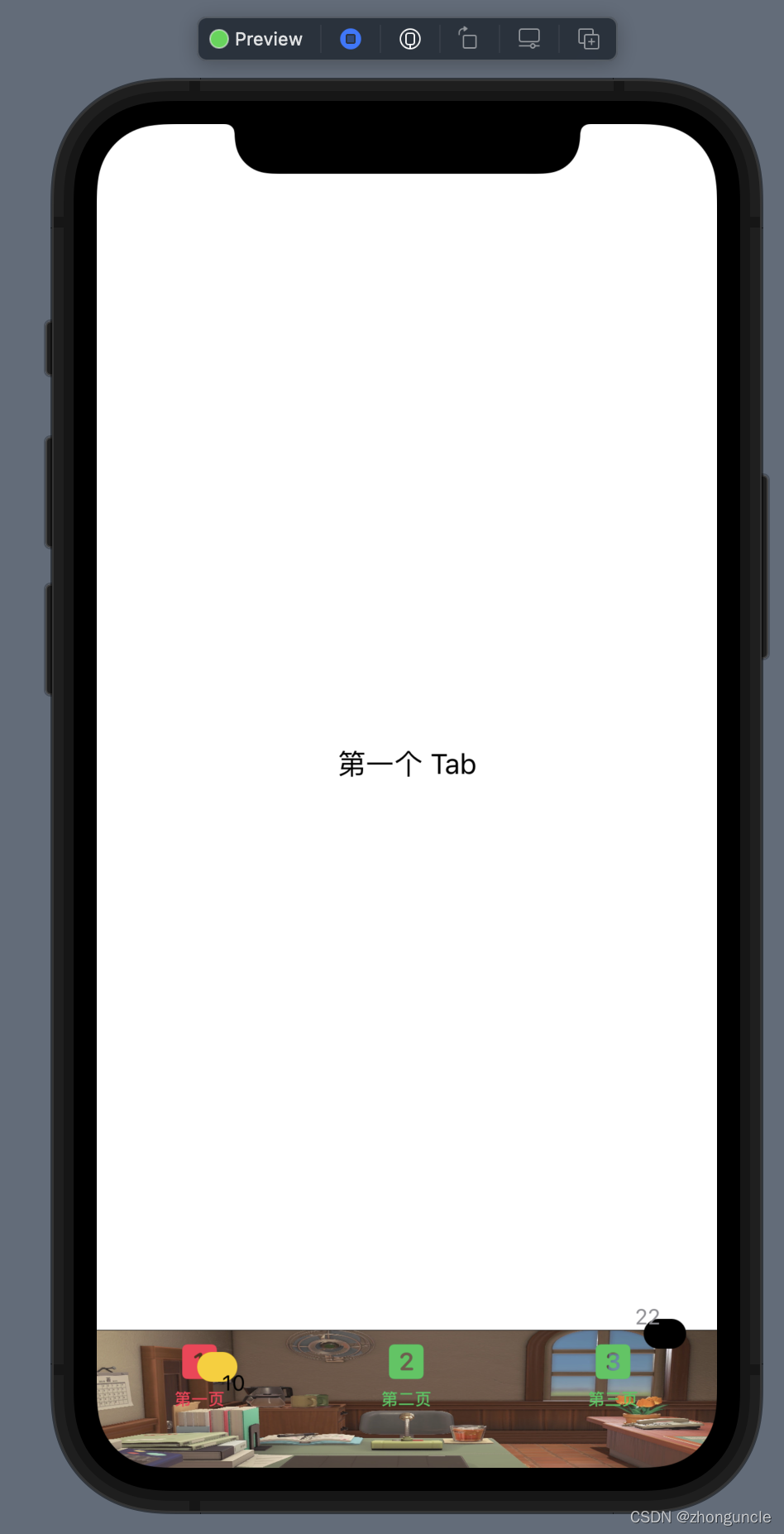
Complete code and demo screenshots
The complete code is as follows:
struct ContentView: View {
     init() {
         //Modify objects in TabBar, such as icon text, etc.
         let itemAppearance = UITabBarItemAppearance()
         //Label
         //The color of the icon——that is, the color of the Image
             //The color of the icon of the unselected label
             itemAppearance.normal.iconColor = UIColor(Color.green)
             //The color of the icon of the selected label
             itemAppearance.selected.iconColor = UIColor(Color.pink)
         //The color of the text——that is, the color of Text
         //For the sake of conciseness of the code, only modifying the text color is demonstrated here. In addition to changing the color, you can also change the font type, size, shadow, background, and even content. Details can be found at https://www.hackingwithswift.com/articles/113/nsattributedstring-by-example
             //The color of the title of unselected tags
             itemAppearance.normal.titleTextAttributes = [.foregroundColor: UIColor(Color.green)]
             //The color of the title of the selected tag
             itemAppearance.selected.titleTextAttributes = [.foregroundColor: UIColor(Color.pink)]

         //bubble
         //It should be noted that if only the value in the normal or selected state is set, then this value will be used regardless of the state!
         //background color
             //Background color of bubbles for unselected tags
             itemAppearance.normal.badgeBackgroundColor = UIColor(Color.black)
             //The background color of the bubble of the selected label
             itemAppearance.selected.badgeBackgroundColor = UIColor(Color.yellow)
         //Text attribute——For the sake of code simplicity, only modifying the text color is demonstrated here. In addition to changing the color, you can also change the font type, size, shadow, background, and even content. Details can be found at https://www.hackingwithswift.com/articles/113/nsattributedstring-by-example
             //The text color of the bubble of the selected label
             itemAppearance.normal.badgeTextAttributes = [.foregroundColor: UIColor(Color.gray)]
             //The text color of the bubble of the selected label
             itemAppearance.selected.badgeTextAttributes = [.foregroundColor: UIColor(Color.black)]
         //Location
             //The position of the bubble of the unselected label
             itemAppearance.normal.badgePositionAdjustment = UIOffset(horizontal: -10, vertical: -10)
             //The position of the bubble of the unselected label
             itemAppearance.selected.badgePositionAdjustment = UIOffset(horizontal: 10, vertical: 10)
         //The position of the title————This offset is superimposed on the position offset of the bubble, but the horizontal axes of the two reference systems are opposite.
             //The position of the bubble title of the unselected label
             itemAppearance.normal.badgeTitlePositionAdjustment = UIOffset(horizontal: -10, vertical: -10)
             //The position of the bubble title of the unselected label
             itemAppearance.selected.badgeTitlePositionAdjustment = UIOffset(horizontal: 10, vertical: 10)

         let appeareance = UITabBarAppearance()
         //Here we can apply the itemAppearance we set above to the stackedLayoutAppearance property of UITabBarAppearance()
         appeareance.stackedLayoutAppearance = itemAppearance
         //TabBar background image
         appearance.backgroundImage = UIImage(named: "test")
         //TabBar background color
         appearance.backgroundColor = UIColor(Color.white)
         //The shadow of TabBar is the top "line"
         appearance.shadowColor = UIColor(Color.black)
         //The placement format of tabItems. .automatic is the default format; .centered means to move to the middle as much as possible; .fill means to fill the TabBar as much as possible.
         appearance.stackedItemPositioning = .centered
         //The spacing between tabItems, but the biggest effect is that it is the same as the .fill format and will not exceed the view.
         appearance.stackedItemSpacing = 2000

         //To apply all previous settings to the view
         //Using this will not apply our settings for UITabBarAppearance()
// UITabBar.appearance().standardAppearance = appeareance
         UITabBar.appearance().scrollEdgeAppearance = appeareance
     }
     var body: some View {
         TabView {
             Text("First Tab")
                 .badge(10) /* This is new in iOS 15.0 and cannot be used in previous versions */
                 .tabItem {
                     Image(systemName: "1.square.fill")
                     Text("first page")
                 }
             Text("Another Tab")
                 .tabItem {
                     Image(systemName: "2.square.fill")
                     Text("Second page")
                 }
             Text("Last Tab")
                 .badge(22) /* This is new in iOS 15.0 and cannot be used in previous versions */
                 .tabItem {
                     Image(systemName: "3.square.fill")
                     Text("Page 3")
                 }
         }
     }
}
The running screenshot is as follows:
End
Okay, after reading this article, I believe you can make the TabView you want~
I hope these will help someone in need~